Buttons
Categories:
GS_ButtonComponent is an enhanced button that adds GS_Motion-based animations for hover and select states. For the full guide, see The Basics: UI Interaction.
For component properties and API details, see the Framework API reference.
Contents
How It Works
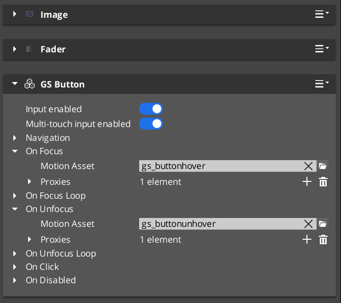
The GS_ButtonComponent connects to LyShine’s interactable notification system. When the interactable reports a hover event, the button plays its hover animation. When it reports an unhover event, the animation reverses or stops. Select works the same way.
Animations are defined as .uiam assets and assigned in the Inspector. Each button can have independent hover and select motions.
Integration with Page Focus
When page navigation moves focus to a button (via keyboard or gamepad), the button treats focus as a hover event and plays its hover animation. This ensures consistent visual feedback regardless of input method.
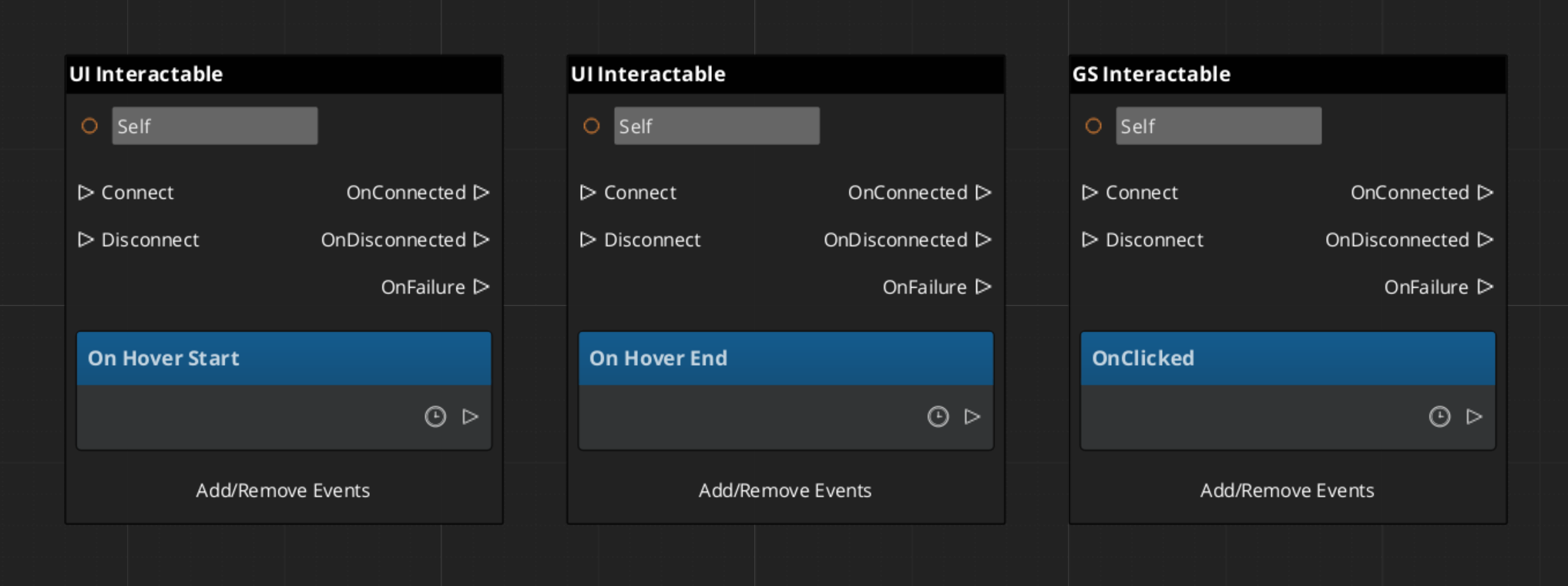
Handling Button Events
Glossary
| Term | Meaning |
|---|---|
| GS_ButtonComponent | An enhanced button with GS_Motion-based hover and select animations |
| Hover Animation | A .uiam motion that plays when the button receives focus or mouse hover |
| Select Animation | A .uiam motion that plays when the button is activated |
For full definitions, see the Glossary.
See Also
For the full API, component properties, and C++ extension guide:
For related systems:
Get GS_UI
GS_UI — Explore this gem on the product page and add it to your project.