Buttons
Categories:
GS_ButtonComponent is an enhanced button that extends O3DE’s LyShine interactable system with UiAnimationMotion support. Instead of relying on LyShine’s built-in state sprites or color transitions, GS_ButtonComponent plays data-driven motion assets for hover, unhover, and select states, giving you full control over animated button feedback using the same animation system that drives page transitions.
The component attaches to any entity that already has a LyShine interactable (e.g. UiButtonComponent). It listens for LyShine interactable notifications and triggers the appropriate motion asset when the interactable state changes.
For usage guides and setup examples, see The Basics: GS_UI.
Contents
How It Works
LyShine Integration
GS_ButtonComponent connects to O3DE’s UiInteractableNotificationBus on the same entity. When LyShine fires hover, unhover, or press events, the component intercepts them and plays the corresponding UiAnimationMotion asset. This means you author your button animations as .uiam assets in the same workflow as page transitions and other UI animations.
The component does not replace LyShine’s interactable – it works alongside it. The LyShine UiButtonComponent still handles click detection, navigation, and accessibility. GS_ButtonComponent adds the visual animation layer on top.
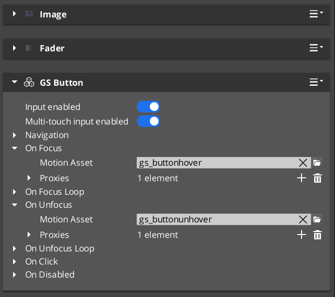
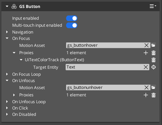
Motion States
Each button can have up to three motion assets assigned:
- Hover Motion – Played when the interactable receives hover focus (mouse enter or gamepad navigation highlight).
- Unhover Motion – Played when the interactable loses hover focus.
- Select Motion – Played when the interactable is pressed/selected.
Each of these is a UiAnimationMotion struct that references a .uiam asset. The motion can animate any combination of the eight UI track types (position, scale, rotation, alpha, color, text size) to create rich button feedback.
Inspector Properties
| Property | Type | Description |
|---|---|---|
| Hover Motion | UiAnimationMotion | The animation played when this button receives hover focus. |
| Unhover Motion | UiAnimationMotion | The animation played when this button loses hover focus. |
| Select Motion | UiAnimationMotion | The animation played when this button is pressed. |
Usage
Setup
- Add a LyShine
UiButtonComponent(or other interactable) to your entity. - Add
GS_ButtonComponentto the same entity. - Author
.uiamassets for the hover, unhover, and select states using the UiAnimationMotion system. - Assign the
.uiamassets to the corresponding fields in the Inspector.
The button will now play the assigned animations automatically when the user interacts with it. No ScriptCanvas or C++ code is required for the animation behavior.
See Also
For component references:
- UI Animation – The motion asset system that drives button animations
- Page Navigation – Pages use the same UiAnimationMotion system for show/hide transitions
- UI Input – Input interception used alongside buttons in interactive canvases
For conceptual overviews and usage guides:
- GS_UI Overview – Full gem overview and installation
Get GS_UI
GS_UI — Explore this gem on the product page and add it to your project.