GS_UI
The complete UI framework for GS_Play — canvas lifecycle management, single-tier page navigation, enhanced buttons, data-driven animation, and input interception.
GS_UI is the complete user interface framework for GS_Play, built on top of O3DE’s LyShine rendering layer. It provides a singleton manager for canvas lifecycle and focus, a single-tier page navigation architecture, motion-based button animations, a LyShine-specific track animation system authored as data assets, and input interception utilities for pause menus and stage transitions.
For architecture details, component properties, and extending the system in C++, see the GS_UI API.
Quick Navigation
| I want to… | Feature | API |
|---|
| Load and unload UI canvases, manage focus stack, or set startup focus | UI Manager | API |
| Navigate between pages, handle back navigation, or cross canvas boundaries | Page Navigation | API |
| Add button animations or intercept input for UI canvases | UI Interaction | API |
| Animate UI elements with position, scale, rotation, alpha, and color tracks | UI Animation | API |
| Add a load screen or pause menu | Widgets | API |
Installation
GS_UI requires GS_Core and LyShine. Add both gems to your project before placing UI components.
For a full guided walkthrough, follow the Simple Project Setup guide.
Quick Installation Summary
- Enable the GS_UI gem in your project configuration.
- Create a UI Manager prefab and add it to the Game Manager’s Managers list.
- Create LyShine UI canvases with GS_UIPageComponent on root elements.
- Create
.uiam animation assets for page transitions and button effects.
UI Manager
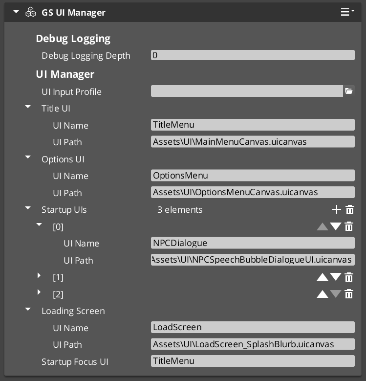
The UI Manager is the singleton that owns canvas lifecycle for the entire game session. It loads and unloads canvases by name, maintains a global focus stack, and handles startup focus deterministically. All canvas operations go through the Manager so that cross-canvas navigation and focus transitions remain coordinated.
UI Manager
API
Page Navigation
Page Navigation is the single-tier architecture that structures all navigable screens. Canvases contain root pages that can parent nested child pages recursively. Navigation is driven through the Page component: NavigateTo, NavigateBack, ChangePage, and ChangeUI handle all routing. Pages play UiAnimationMotion assets on show and hide for data-driven transitions.
Page Navigation
API
UI Interaction
Enhanced button animations and input interception. GS_ButtonComponent extends LyShine interactables with UiAnimationMotion-based hover and select animations. GS_UIInputInterceptorComponent captures input events while a canvas is focused, preventing them from reaching gameplay. Both systems work together on interactive canvases.
UI Interaction
API
UI Animation
UI Animation extends GS_Motion with eight LyShine-specific tracks: position, scale, rotation, element alpha, image alpha, image color, text color, and text size. Tracks are authored together in .uiam assets and played in parallel at runtime. Page components embed motion instances for show/hide transitions, and a standalone component makes animations available on any UI entity.
UI Animation
API
Standalone UI components for game-event-driven scenarios outside the page navigation model. Load screens display automatically during stage transitions. Pause menus overlay gameplay and suppress gameplay input while active.
Widgets
API
See Also
For the full API, component properties, and C++ extension guide:
For step-by-step project setup:
Get GS_UI
GS_UI — Explore this gem on the product page and add it to your project.
1 - UI Manager
How to work with the GS_Play UI Manager — canvas lifecycle, focus stack, and cross-canvas navigation.
The UI Manager is the singleton controller for all UI canvases in your project. It loads and unloads canvases, maintains a global focus stack that tracks which canvas the player is currently interacting with, and handles cross-canvas navigation so that opening a pause menu over gameplay UI and returning to it works automatically.
For architecture details, component properties, and extension patterns, see the Framework API reference.
Contents
How It Works
The UI Manager maintains a global focus stack — a history of which UI canvas has focus. When you open a new canvas (like a pause menu), it pushes onto the stack. When you close it, the previous canvas (gameplay HUD) regains focus automatically.
At startup, the UI Manager loads canvases and waits for root pages to register. One canvas is designated as the startup focus UI — it receives focus automatically when the startup sequence completes.
Loading and Unloading Canvases
| ScriptCanvas Node | What It Does |
|---|
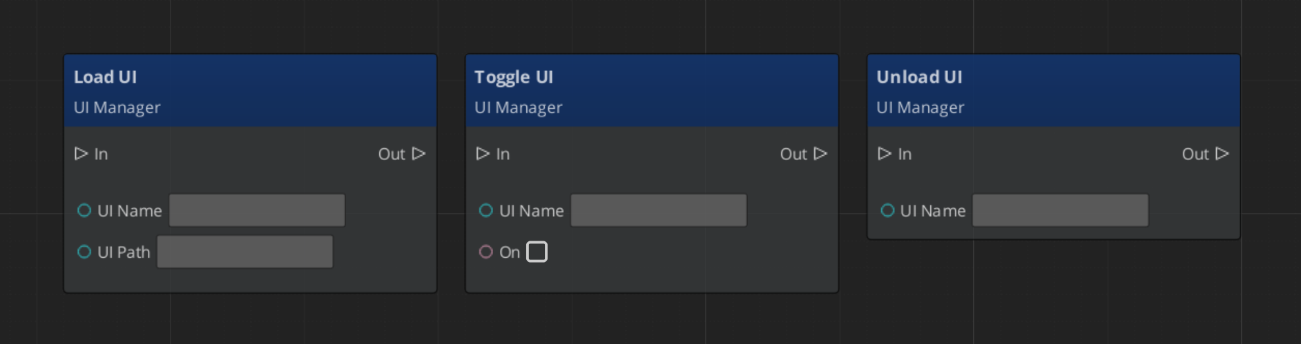
LoadGSUI(name, path) | Loads a UI canvas from an asset path and registers it by name. |
UnloadGSUI(name) | Unloads a canvas and removes it from the active map. |
FocusUI(name) | Pushes a canvas onto the global focus stack and focuses its root page. |
NavLastUI | Pops the current canvas off the focus stack and returns focus to the previous one. |
ToggleUI(name, on) | Shows or hides a canvas without changing the focus stack. |
ScriptCanvas
If you wish to change between canvases, leaving the previous inactive, and enabling the next:
Toggle off your current canvas, then focus the next. Focus automatically handles enabling the canvas for use.
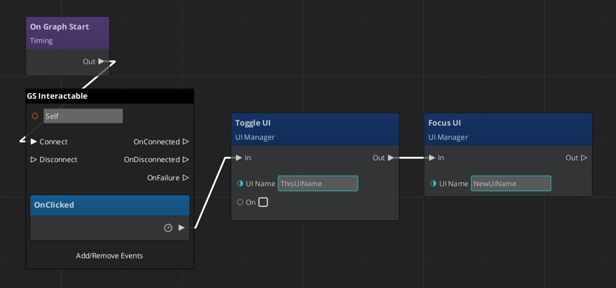
Using Page: NavigateBack will naturally hide the new canvas, and reactivate the past one.
Querying UI State
| ScriptCanvas Node | What It Does |
|---|
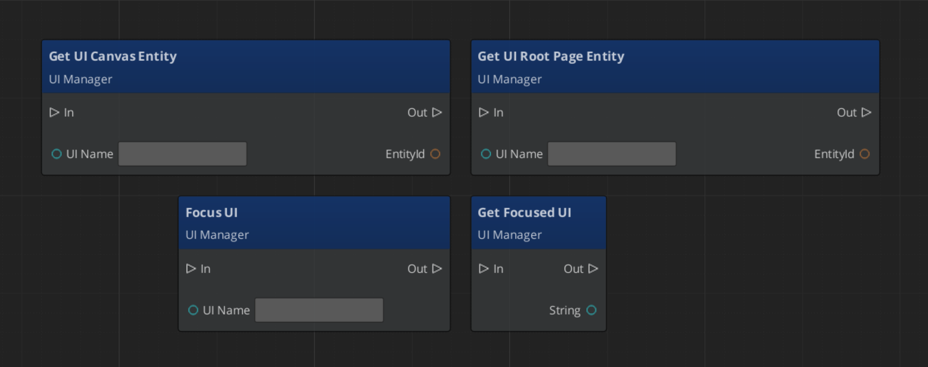
GetFocusedUI | Returns the name of the canvas currently on top of the focus stack. |
GetUICanvasEntity(name) | Returns the canvas entity for a named UI. |
GetUIRootPageEntity(name) | Returns the root page entity for a named UI. |
ScriptCanvas
Quick Reference
| Need | Bus | Method |
|---|
| Load a canvas | UIManagerRequestBus | LoadGSUI(name, path) |
| Unload a canvas | UIManagerRequestBus | UnloadGSUI(name) |
| Focus a canvas | UIManagerRequestBus | FocusUI(name) |
| Return to previous canvas | UIManagerRequestBus | NavLastUI |
| Show/hide a canvas | UIManagerRequestBus | ToggleUI(name, on) |
| Get focused canvas name | UIManagerRequestBus | GetFocusedUI |
Glossary
| Term | Meaning |
|---|
| UI Canvas | A LyShine canvas loaded and managed by the UI Manager |
| Focus Stack | A global history of focused canvases — opening a new one pushes, closing pops |
| Root Page | A page registered with the UI Manager as a canvas entry point |
For full definitions, see the Glossary.
See Also
For the full API, component properties, and C++ extension guide:
For related systems:
Get GS_UI
GS_UI — Explore this gem on the product page and add it to your project.
2 - Page Navigation
How to work with GS_Play page navigation — single-tier page hierarchy, focus management, and transitions.
Page Navigation is the core of the GS_UI system. Pages are the fundamental unit of UI organization — each page represents a screen, panel, or section of your interface. Pages can be root pages (registered with the UI Manager as a canvas entry point) or nested child pages (managed by a parent page). Navigation uses a push/pop focus stack so the system always knows where to return when the player backs out.
For architecture details, the NavigateTo algorithm, and component internals, see the Framework API reference.
Contents
Page Types
| Type | How It’s Configured | What It Does |
|---|
| Root Page | m_isRoot = true | Registers with the UI Manager by name. Acts as the canvas entry point. |
| Child Page | m_isRoot = false | Registers with its parent page automatically. Managed by parent’s show/hide logic. |
A canvas typically has one root page at the top, with child pages nested beneath it for sub-screens (settings tabs, inventory categories, confirmation dialogs).
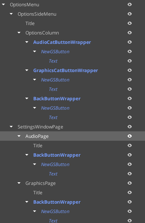
Example of pages within pages to determine UI display structure, and handling changing focus between pages. SettingsWindowPage represents the main options windows. The child pages are the actual different windows that display within the space, changing with side menu changes.
For guides on complex page navigation, see Lesson: Create UI.
Required Companion Components
Root page entities require two additional components alongside GS_UIPageComponent:
| Component | Why It’s Needed |
|---|
| FaderComponent | Drives alpha-based fade transitions for show/hide animations. |
| HierarchicalInteractionToggleComponent | Disables input on the entire page subtree when the page is hidden, preventing clicks from reaching invisible elements. |
Add both to every root page entity in the UI Editor.
Navigation Methods
These are the primary methods for controlling page flow:
| ScriptCanvas Node | What It Does |
|---|
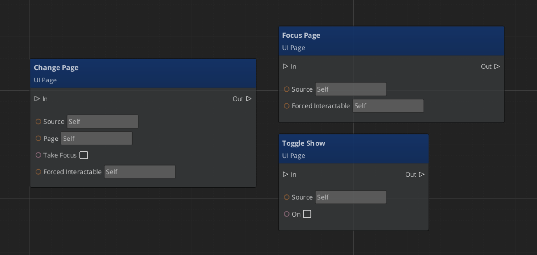
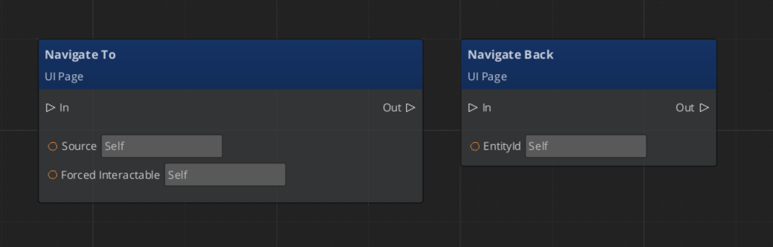
NavigateTo(forced) | Focuses this page. Automatically pushes at the correct ancestor level in the hierarchy. |
NavigateBack | Walks up the page hierarchy to find the first ancestor with a non-empty focus stack and pops it. If no stack is found, calls NavLastUI on the UI Manager (closes the canvas). |
ChangePage(target, takeFocus, forced) | Swaps the displayed child page without pushing a new focus stack entry. |
ToggleShow(on) | Shows or hides this page. |
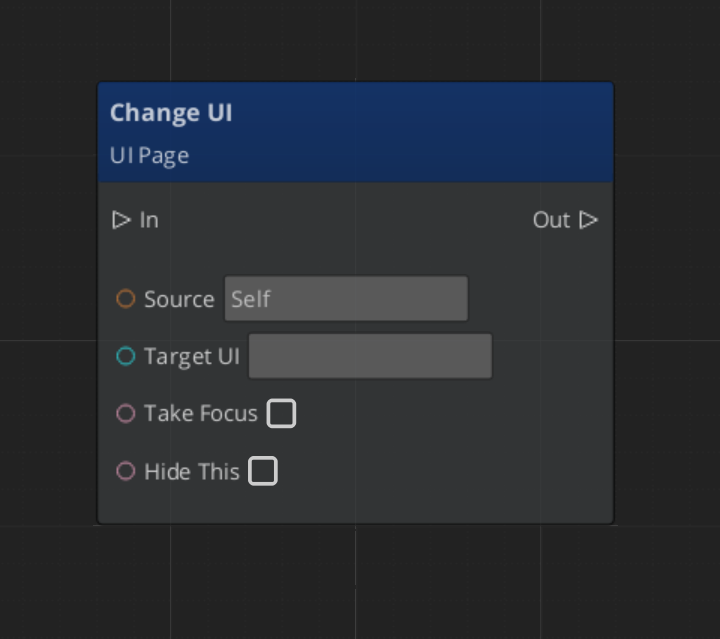
ChangeUI(targetUI, takeFocus, hideThis) | Cross-canvas navigation — switches to a different UI canvas. |
FocusChildPageByName(name, forced) | Focuses a child page by its m_pageName string. |
Handling Page Components
Navigating Pages
Changing UIs
Return Policies
Each page has a NavigationReturnPolicy that controls which element gets focus when the page is returned to:
| Policy | Behavior |
|---|
| RestoreLast | Returns focus to the last interactable the player was on (e.g., resume where you left off). |
| AlwaysDefault | Always returns to the page’s default interactable (e.g., always land on “New Game” button). |
Page Transitions
Pages support three motion slots for animated transitions:
| Slot | When It Plays |
|---|
onShow | When the page becomes visible. |
onShowLoop | Loops continuously while the page is visible. |
onHide | When the page is hidden. |
Each slot takes a .uiam (UI Animation Motion) asset. See UI Animation for track types.
Quick Reference
| Need | Bus | Method |
|---|
| Navigate to a page | UIPageRequestBus | NavigateTo(forced) |
| Go back | UIPageRequestBus | NavigateBack |
| Switch child page | UIPageRequestBus | ChangePage(target, takeFocus, forced) |
| Show/hide a page | UIPageRequestBus | ToggleShow(on) |
| Switch canvases | UIPageRequestBus | ChangeUI(targetUI, takeFocus, hideThis) |
| Focus child by name | UIPageRequestBus | FocusChildPageByName(name, forced) |
Glossary
| Term | Meaning |
|---|
| Page | The fundamental UI unit — a screen, panel, or section of the interface |
| Root Page | A page registered with the UI Manager as a canvas entry point |
| Child Page | A page managed by a parent page, navigated to via ChangePage or FocusChildPageByName |
| NavigationReturnPolicy | Controls which element gets focus when returning to a page (RestoreLast or AlwaysDefault) |
For full definitions, see the Glossary.
See Also
For the full API, component properties, and C++ extension guide:
For related systems:
Get GS_UI
GS_UI — Explore this gem on the product page and add it to your project.
3 - UI Interaction
How to work with GS_Play UI interaction — motion-based button animations and input interception for focused canvases.
UI Interaction covers two systems that handle player input at the UI layer: enhanced buttons with motion-based hover and select animations, and the input interceptor that captures input events while a canvas is focused.
For component properties and the full API, see the Framework API reference.
Contents
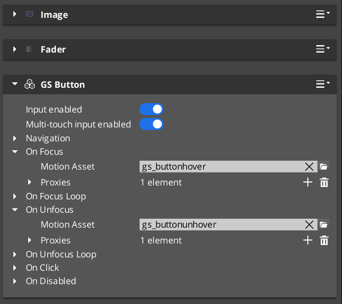
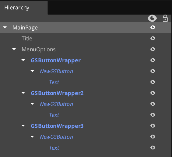
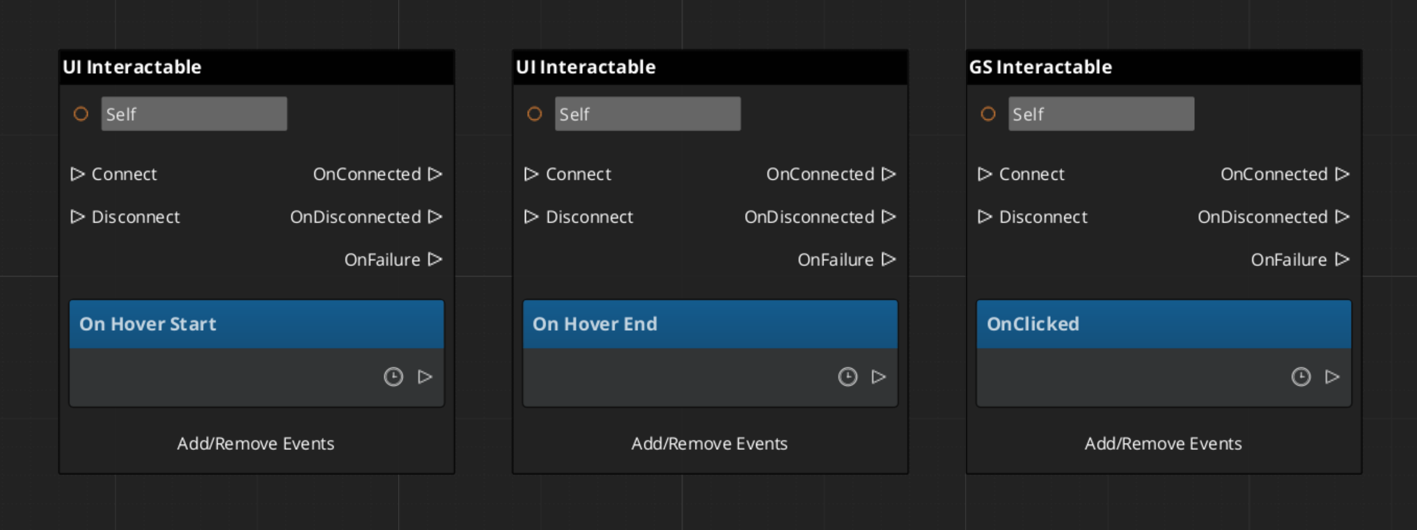
GS_ButtonComponent extends LyShine’s interactable system with UiAnimationMotion support. When the player hovers over a button (mouse or gamepad navigation), a configurable animation plays. When the button is selected, a separate animation fires. Both animations use .uiam assets, giving full control over position, scale, rotation, alpha, and color transitions.
Setup
- Add a LyShine
UiButtonComponent (or other interactable) to your entity. - Add
GS_ButtonComponent to the same entity. - Author
.uiam assets for hover, unhover, and select states. - Assign the assets to the corresponding fields in the Inspector.
Integration with Page Focus
When page navigation moves focus to a button (via keyboard or gamepad), the button treats focus as a hover event and plays its hover animation. This ensures consistent visual feedback regardless of input method.
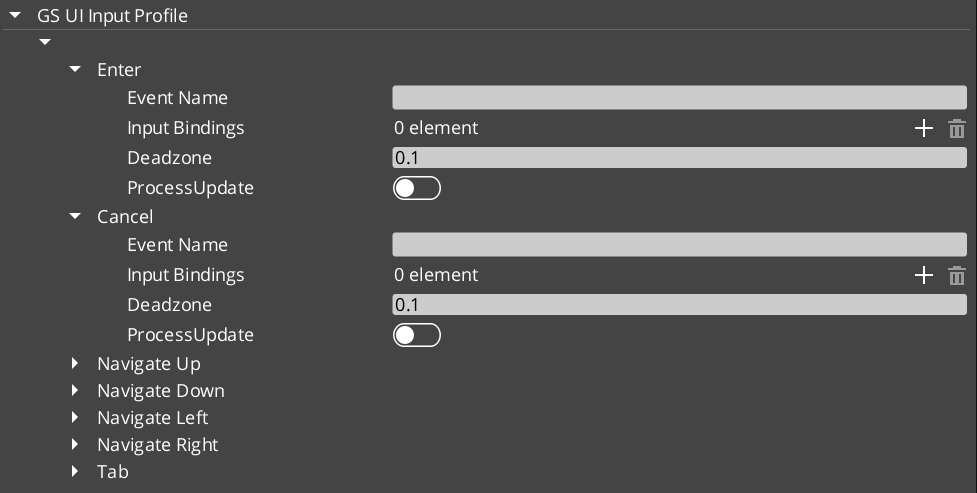
GS_UIInputInterceptorComponent prevents input from leaking to gameplay systems while a UI canvas is active. It uses a GS_UIInputProfile asset to define which input channels to intercept. Intercepted events are re-broadcast on UIInputNotificationBus so UI-specific logic can respond to them.
When the canvas loses focus, the interceptor deactivates automatically and input flows normally back to gameplay.
Setup
- Add
GS_UIInputInterceptorComponent to the root page entity. - Configure a
GS_UIInputProfile asset with the channels to intercept. - Connect to
UIInputNotificationBus in any component that should respond to intercepted events.
Integration
Buttons and input interception work together on interactive canvases:
- The input interceptor blocks gameplay input while a menu is open.
- Buttons provide visual hover/select feedback driven by
UIInputNotificationBus events. - The page system routes gamepad focus to the correct button automatically.
Glossary
| Term | Meaning |
|---|
| GS_ButtonComponent | An enhanced button with GS_Motion-based hover and select animations |
| Hover Animation | A .uiam motion that plays when the button receives focus or mouse hover |
| Select Animation | A .uiam motion that plays when the button is activated |
| GS_UIInputInterceptorComponent | Component that captures input events while a canvas is focused |
| GS_UIInputProfile | Data asset defining which input channels to intercept |
For full definitions, see the Glossary.
See Also
For the full API, component properties, and C++ extension guide:
For related systems:
Get GS_UI
GS_UI — Explore this gem on the product page and add it to your project.
3.1 - Buttons
Redirected — button documentation is now part of UI Interaction.
GS_ButtonComponent is an enhanced button that adds GS_Motion-based animations for hover and select states. For the full guide, see The Basics: UI Interaction.
For component properties and API details, see the Framework API reference.
Contents
How It Works
The GS_ButtonComponent connects to LyShine’s interactable notification system. When the interactable reports a hover event, the button plays its hover animation. When it reports an unhover event, the animation reverses or stops. Select works the same way.
Animations are defined as .uiam assets and assigned in the Inspector. Each button can have independent hover and select motions.
Integration with Page Focus
When page navigation moves focus to a button (via keyboard or gamepad), the button treats focus as a hover event and plays its hover animation. This ensures consistent visual feedback regardless of input method.
Glossary
| Term | Meaning |
|---|
| GS_ButtonComponent | An enhanced button with GS_Motion-based hover and select animations |
| Hover Animation | A .uiam motion that plays when the button receives focus or mouse hover |
| Select Animation | A .uiam motion that plays when the button is activated |
For full definitions, see the Glossary.
See Also
For the full API, component properties, and C++ extension guide:
For related systems:
Get GS_UI
GS_UI — Explore this gem on the product page and add it to your project.
4 - UI Animation
How to work with GS_Play UI animations — motion-based LyShine property animation for pages, buttons, and standalone components.
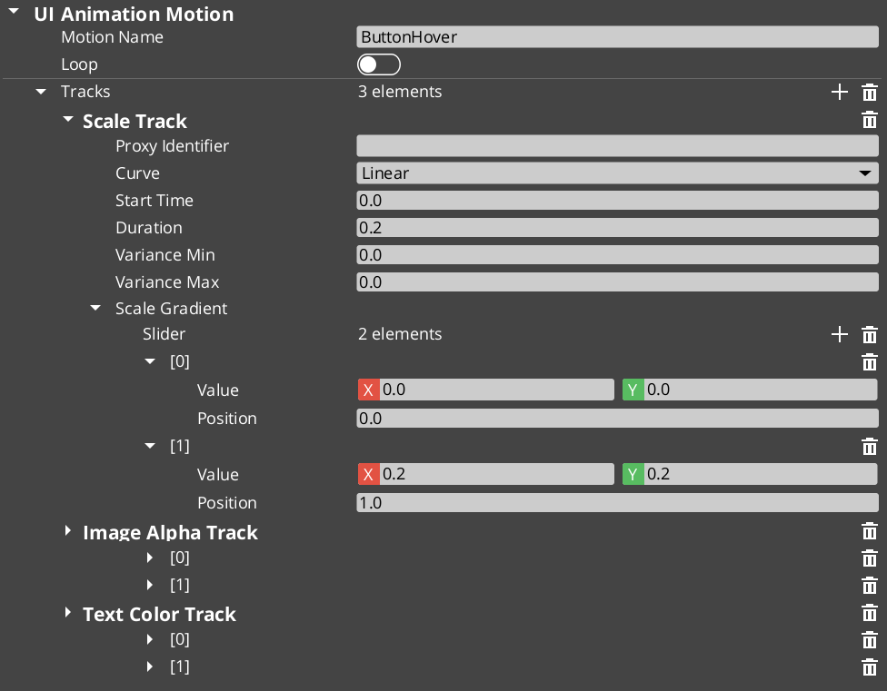
UI Animation extends the GS_Motion system with 8 LyShine-specific animation tracks. Animations are authored as .uiam (UI Animation Motion) assets in the O3DE Asset Editor and can be used for page transitions, button hover effects, and standalone component animation.
For track type details, the domain extension pattern, and component internals, see the Framework API reference.
Contents
Available Tracks
Each track animates a single LyShine property over time:
| Track | Target Component | What It Animates |
|---|
| Position | Any LyShine element | Position offset from anchor |
| Scale | Any LyShine element | Element scale |
| Rotation | Any LyShine element | Element rotation |
| Element Alpha | Any LyShine element | Whole-element transparency |
| Image Alpha | UiImageComponent | Image-specific transparency |
| Image Color | UiImageComponent | Image color tint |
| Text Color | UiTextComponent | Text color |
| Text Size | UiTextComponent | Font size |
Multiple tracks can run simultaneously within a single motion — for example, a page show animation might fade in (Element Alpha) while sliding up (Position) and scaling from 90% to 100% (Scale).
Where Animations Are Used
| Context | How It’s Assigned |
|---|
| Page transitions | Assigned to onShow, onShowLoop, and onHide slots on GS_UIPageComponent. |
| Button states | Assigned to hover and select slots on GS_ButtonComponent. |
| Standalone playback | Assigned to UiAnimationMotionComponent on any entity. |
Authoring Animations
- Create a new
.uiam asset in the O3DE Asset Editor. - Add tracks for the properties you want to animate.
- Configure timing, easing curves, and property values for each track.
- Optionally set track identifiers for proxy targeting.
- Assign the asset to a component slot in the Inspector.
Proxy Targeting
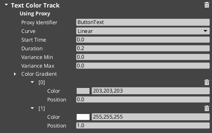
When tracks have identifiers (named labels), they appear in the motion’s proxy list. Proxies let you redirect a track to a different entity in the UI hierarchy — for example, animating a background panel separately from a content area within the same page transition.
Quick Reference
| Need | How |
|---|
| Animate a page transition | Assign .uiam assets to onShow/onHide slots on the page |
| Animate a button hover | Assign .uiam asset to the button’s hover slot |
| Play an animation on any entity | Add UiAnimationMotionComponent and assign a .uiam asset |
| Target a child element | Use proxy entries to redirect tracks |
| Loop an animation | Enable loop on the motion asset |
Glossary
| Term | Meaning |
|---|
| UI Animation Motion (.uiam) | A data asset containing LyShine-specific animation tracks for UI elements |
| UiAnimationMotionComponent | A standalone component for playing UI animations on any entity |
| Proxy Targeting | Redirecting a track to a different entity in the UI hierarchy via named labels |
For full definitions, see the Glossary.
See Also
For the full API, component properties, and C++ extension guide:
For related systems:
Get GS_UI
GS_UI — Explore this gem on the product page and add it to your project.
5 - Widgets
How to work with GS_Play UI widgets — load screens, pause menus, and other standalone UI components.
Widgets are standalone UI components that handle specific game scenarios outside the page navigation model. They activate and deactivate in response to game events rather than player navigation — a load screen appears during a stage transition, a pause menu overlays gameplay when the player pauses.
For component properties and the full API, see the Framework API reference.
Contents
Load Screen
GS_LoadScreenComponent shows a loading canvas during stage transitions and hides it when loading is complete. Place it on the Game Manager entity and configure a LyShine canvas to use as the loading screen.
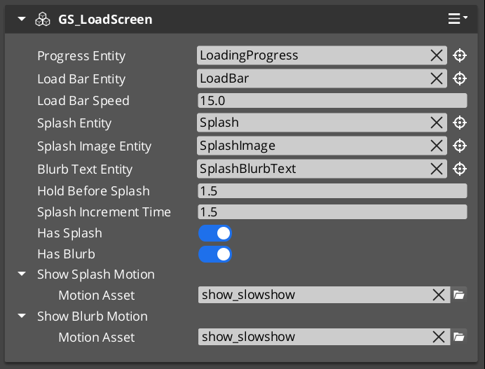
The component listens for StageManagerNotificationBus events and drives the canvas visibility automatically — no ScriptCanvas or manual triggers required.
PauseMenuComponent handles the pause overlay. It listens for the configured pause input action and toggles a designated pause canvas on and off, broadcasting events so other systems know to yield control.
Glossary
| Term | Meaning |
|---|
| Widget | A standalone UI component that activates in response to game events rather than player navigation |
| Load Screen | A canvas displayed during stage transitions, managed by GS_LoadScreenComponent |
| Pause Menu | An overlay canvas displayed when the game is paused, managed by PauseMenuComponent |
For full definitions, see the Glossary.
See Also
For the full API, component properties, and C++ extension guide:
For related systems:
Get GS_UI
GS_UI — Explore this gem on the product page and add it to your project.