GS_UI
The complete UI framework — single-tier page navigation, motion-based animations, enhanced buttons, input interception, load screens, and pause menus.
GS_UI is the gem that builds the game’s interface layer on top of O3DE’s LyShine system. It replaces the old multi-tier Hub/Window/Page hierarchy with a clean single-tier model: the UI Manager owns canvases, and each canvas root is a Page that can parent any depth of nested child Pages. Navigation is fully recursive — any page can push, pop, or swap focus within its subtree. Animations are authored as .uiam data assets using eight LyShine-specific motion tracks (position, scale, rotation, alpha, color, text). Buttons, input interception, load screens, and pause menus round out the feature set.
For usage guides and setup examples, see The Basics: GS_UI.
Contents
UI Manager
The singleton that owns all loaded canvases. The UI Manager loads and unloads canvases by name, maintains a global focus stack across canvases, and drives the startup focus sequence deterministically.
| Component | Purpose |
|---|
| GS_UIManagerComponent | Singleton manager. Loads canvases, maintains global focus stack, drives startup focus. |
UI Manager API
Page Navigation
The core navigation system. A single GS_UIPageComponent replaces the old Hub, Window, and Page roles. When m_isRoot is true, the page registers itself with the UI Manager as a root canvas entry point. Pages can parent other pages to form any navigation depth. Focus is managed through push/pop stacks at each level.
| Component | Purpose |
|---|
| GS_UIPageComponent | Core navigation component. Handles root canvas registration, child page management, focus push/pop, and show/hide transitions. |
Pages API
UI Interaction
The button and input interception layer. GS_ButtonComponent plays motion-based animations on hover and select. GS_UIInputInterceptorComponent captures input events while a canvas is focused, preventing them from reaching gameplay systems.
UI Interaction API
UI Animation
A GS_Motion extension with eight LyShine-specific animation tracks. Animations are authored as .uiam assets in the editor and referenced by page transition fields or played directly by the standalone motion component.
UI Animation API
Standalone UI components for game-event-driven scenarios outside the page navigation model — load screens during transitions, pause menus overlaying gameplay.
Widgets API
Installation
GS_UI requires GS_Core, LyShine, and LmbrCentral.
- Enable GS_UI in Project Manager or
project.json. - Add GS_UIManagerComponent to the Game Manager entity and register it in the Startup Managers list.
- Create a LyShine canvas and add GS_UIPageComponent (with
m_isRoot = true) to the root element. - Set
m_uiName on the root page to match the name you will use when calling LoadGSUI. - Nest child pages under the root by adding GS_UIPageComponent to child entities and connecting them through
m_defaultChildPage. - Refer to the UI Set Up Guide for a full walkthrough.
See Also
For conceptual overviews and usage guides:
For related resources:
Get GS_UI
GS_UI — Explore this gem on the product page and add it to your project.
1 - UI Manager
The singleton manager that owns all loaded UI canvases, maintains a global focus stack, and drives the startup focus sequence.
For usage guides and setup examples, see The Basics: GS_UI.
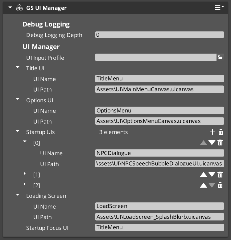
The UI Manager is the singleton that controls the lifecycle of every UI canvas in your project. It loads and unloads LyShine canvases by name, maintains a global focus stack that tracks which canvas is currently active, and drives the startup focus sequence so that the correct UI appears automatically when the game finishes initializing.
GS_UIManagerComponent extends GS_ManagerComponent, which means it participates in the Game Manager’s staged startup. It is spawned by the Game Manager alongside other managers and receives OnStartupComplete to begin loading canvases and focusing the startup UI.
Contents
How It Works
Canvas Lifecycle
Each UI canvas is identified by a unique name string. You call LoadGSUI(name, path) to load a canvas from a .uicanvas asset path and associate it with the given name. The manager stores this in its m_activeUIs map. When you no longer need the canvas, call UnloadGSUI(name) to destroy it and remove it from the map.
Once a canvas is loaded, its root page component (a GS_UIPageComponent with m_isRoot = true) calls RegisterRootPage(name, entity) to register itself as the entry point for that canvas. The manager returns true if registration succeeds, false if the name is already registered or does not match a loaded canvas.
Global Focus Stack
The UI Manager maintains m_globalFocusStack, which tracks the order of focused canvases. When you call FocusUI(name), the named canvas is pushed onto the focus stack and becomes the active UI. NavLastUI() pops the current canvas and returns focus to the previous one. This allows layered UI flows such as opening a settings menu on top of a pause menu and navigating back through them in order.
ToggleUI(name, on) shows or hides a canvas by name. When toggling on, it calls FocusUI internally; when toggling off, it removes the canvas from the focus stack.
GetFocusedUI() returns the name of the currently focused canvas (the top of the stack).
Startup Sequence
The UI Manager’s startup follows this deterministic sequence:
- OnStartupComplete — The Game Manager broadcasts startup complete. The UI Manager loads all configured canvases via
LoadGSUI. - Root Page Registration — Each canvas’s root page component calls
RegisterRootPage(name, entity) during its own activation. - Startup Focus — The UI Manager checks each registered root page name against
m_startupFocusUI. When it finds a match, it calls FocusUI(name) to focus that canvas as the initial UI.
This sequence ensures that canvases are loaded before pages register, and the correct startup UI receives focus without race conditions.
Data Types
UICanvasWindowPair
A pairing of a loaded LyShine canvas entity with its associated root page entity. Used internally by the UI Manager to track loaded canvases.
UINamePathPair
A pairing of a UI name string with a .uicanvas asset path. Used to configure which canvases the UI Manager loads on startup.
Inspector Properties
| Property | Type | Description |
|---|
| Startup Focus UI | AZStd::string | The name of the UI canvas to focus automatically after startup completes. Must match a registered root page name. |
| UI Name Path Pairs | AZStd::vector<UINamePathPair> | The list of canvas name/path pairs to load on startup. Each entry maps a unique name to a .uicanvas asset path. |
API Reference
Request Bus: UIManagerRequestBus
Commands sent to the UI Manager. Singleton bus — Single address, single handler.
| Method | Parameters | Returns | Description |
|---|
LoadGSUI | const AZStd::string& name, const AZStd::string& path | void | Loads a LyShine canvas from the given asset path and registers it under the given name. |
UnloadGSUI | const AZStd::string& name | void | Destroys the canvas registered under the given name and removes it from the active UI map. |
RegisterRootPage | const AZStd::string& name, AZ::EntityId entity | bool | Registers a root page entity for the named canvas. Returns true on success, false if the name is unrecognized or already registered. |
UnregisterRootPage | const AZStd::string& name | void | Removes the root page registration for the named canvas. |
FocusUI | const AZStd::string& name | void | Pushes the named canvas onto the global focus stack and activates it. |
NavLastUI | — | void | Pops the current canvas from the global focus stack and returns focus to the previous canvas. |
ToggleUI | const AZStd::string& name, bool on | void | Shows or hides the named canvas. Toggling on focuses it; toggling off removes it from the focus stack. |
GetFocusedUI | — | AZStd::string | Returns the name of the currently focused UI canvas (top of the global focus stack). |
GetUICanvasEntity | const AZStd::string& name | AZ::EntityId | Returns the LyShine canvas entity for the named UI. |
GetUIRootPageEntity | const AZStd::string& name | AZ::EntityId | Returns the root page entity registered for the named UI. |
Usage Examples
C++ – Loading and Focusing a UI Canvas
#include <GS_UI/GS_UIBus.h>

// Load a canvas
GS_UI::UIManagerRequestBus::Broadcast(
    &GS_UI::UIManagerRequestBus::Events::LoadGSUI,
    AZStd::string("TitleScreen"),
    AZStd::string("ui/titlescreen.uicanvas")
);

// Focus it
GS_UI::UIManagerRequestBus::Broadcast(
    &GS_UI::UIManagerRequestBus::Events::FocusUI,
    AZStd::string("TitleScreen")
);
C++ – Navigating Back
// Return to the previous UI in the focus stack
GS_UI::UIManagerRequestBus::Broadcast(
    &GS_UI::UIManagerRequestBus::Events::NavLastUI
);
C++ – Toggling a UI Canvas
// Show the pause menu
GS_UI::UIManagerRequestBus::Broadcast(
    &GS_UI::UIManagerRequestBus::Events::ToggleUI,
    AZStd::string("PauseMenu"),
    true
);
See Also
For conceptual overviews and usage guides:
For component references:
Get GS_UI
GS_UI — Explore this gem on the product page and add it to your project.
2 - Page Navigation
The core single-tier navigation component – root canvas registration, nested child page management, focus push/pop stacks, and show/hide transitions.
For usage guides and setup examples, see The Basics: GS_UI.

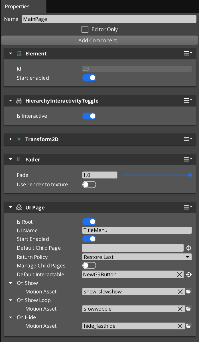
The GS_UIPageComponent in the UI Editor, configured as a root page with a default child page assigned.
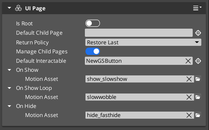
GS_UIPageComponent is the core navigation component of the GS_UI system. It replaces the legacy multi-tier Hub/Window/Page hierarchy with a single, unified component that handles all levels of UI navigation. A single GS_UIPageComponent can serve as a root canvas entry point, a mid-level container, or a leaf page – its role is determined entirely by configuration.
When m_isRoot is set to true, the page registers itself with the UI Manager as the root entry point for its canvas. Non-root pages are nested as children of other pages and managed through their parent’s child page system. This creates a single-tier model where any depth of navigation is achieved through recursive nesting of the same component.
Focus management uses push/pop stacks at each level. When a child page is focused, it is pushed onto its parent’s focus stack. Navigating back pops the stack and restores the previous child. The NavigationReturnPolicy enum controls whether returning to a page restores the last focused child or always resets to the default.
Required Companion Components
Root pages depend on two O3DE components placed on the same entity:
| Component | Purpose |
|---|
| FaderComponent | Drives alpha-based fade transitions during show/hide animations. Required for UiAnimationMotion tracks that animate element alpha. |
| HierarchicalInteractionToggleComponent | Enables or disables the entire interactable subtree when the page shows or hides. Prevents input from reaching hidden page elements. |
These are standard LyShine/LmbrCentral components — add them alongside GS_UIPageComponent on every root page entity.
Contents
How It Works
Root Pages
A root page (m_isRoot = true) is the entry point for a UI canvas. During activation, it calls RegisterRootPage(m_uiName, entityId) on the UIManagerRequestBus to register itself. The m_uiName field must match the name used when the canvas was loaded via LoadGSUI.
When m_startEnabled is true, the root page shows itself immediately upon registration. Otherwise, it remains hidden until the UI Manager calls FocusUI for its canvas name.
Child Page Management
When m_manageChildPages is true, the page acts as a container for child pages. Child pages register themselves with their parent during activation via RegisterChildPage(entity). The parent tracks all registered children and manages which one is currently visible and focused.
Each page maintains its own focus stack. When a child is focused, it is pushed onto the parent’s stack via PushFocus. PopFocus restores the previous child. The m_returnPolicy field controls behavior when navigating back to this page:
- RestoreLast – Restores the last child that was focused before navigating away.
- AlwaysDefault – Always resets to
m_defaultChildPage, ignoring the focus history.
NavigateTo Algorithm
NavigateTo(forced) navigates the UI to show the calling page, regardless of where focus currently sits in the page tree. The algorithm works by building a path from the calling page up to the root, then cascading focus changes downward:
- Build path – Walk up from the calling page to the root, collecting each ancestor into a path array.
- Find divergence point – Starting from the highest ancestor, find the first level where the parent’s currently focused child does not match the path node. This is the “push point.”
- Change pages – From the push point downward, call
ChangePage at each level to switch the visible child to the path node. - Push focus – At the push point, call
PushFocus to record the new child on the parent’s focus stack. - Cascade – Continue down the path to the target page, focusing each level.
This algorithm ensures that navigating to a deeply nested page correctly updates every intermediate level.
NavigateBack Algorithm
NavigateBack() walks up from the calling page to find the first ancestor with a non-empty focus stack, then pops it:
- Walk up – Starting from the calling page, check each ancestor’s focus stack.
- Pop focus – At the first ancestor with a non-empty stack, call
PopFocus to restore the previous child. - Fallback to UI Manager – If no ancestor has a non-empty stack (the user has navigated all the way back to the root), call
NavLastUI() on the UIManagerRequestBus to return to the previous canvas in the global focus stack.
Show/Hide Transitions
Each page can have three UiAnimationMotion assets assigned:
- m_onShow – Played when the page becomes visible.
- m_onShowLoop – Played in a loop after the show animation completes.
- m_onHide – Played when the page is hidden.
These motion assets drive LyShine property animations (position, scale, rotation, alpha, color) to create smooth transitions between pages.
Data Types
NavigationReturnPolicy
Controls how a page restores child focus when navigated back to.
| Value | Description |
|---|
RestoreLast | Restores the last focused child page from the focus stack. |
AlwaysDefault | Always resets to m_defaultChildPage, clearing focus history. |
FocusEntry
A single entry in a page’s focus stack.
| Field | Type | Description |
|---|
focusedChild | AZ::EntityId | The entity ID of the child page that was focused. |
Inspector Properties
| Property | Type | Description |
|---|
| Is Root | bool | When true, this page registers itself with the UI Manager as a root canvas entry point. |
| UI Name | AZStd::string | (Root only) The name this root page registers under. Must match the name used in LoadGSUI. |
| Start Enabled | bool | (Root only) When true, the root page shows itself immediately upon registration. |
| Page Name | AZStd::string | A human-readable name for this page, used for identification and debugging. |
| Default Child Page | AZ::EntityId | The child page entity to show by default when this page is focused. |
| Return Policy | NavigationReturnPolicy | Controls whether returning to this page restores the last child or always resets to the default. |
| Manage Child Pages | bool | When true, this page acts as a container that manages nested child pages. |
| Default Interactable | AZ::EntityId | The LyShine interactable element to focus by default when this page is shown (e.g. the first button). |
| On Show | UiAnimationMotion | Animation played when this page becomes visible. |
| On Show Loop | UiAnimationMotion | Looping animation played after the show animation completes. |
| On Hide | UiAnimationMotion | Animation played when this page is hidden. |
API Reference
Request Bus: UIPageRequestBus
Commands sent to a specific page by entity ID. Addressed bus – addressed by EntityId.
User-Facing Methods
These methods are intended to be called from gameplay code, ScriptCanvas, or other UI components to drive navigation.
| Method | Parameters | Returns | Description |
|---|
NavigateTo | bool forced | void | Navigates the entire page tree to show this page. Builds a path to root and cascades focus changes downward. When forced is true, bypasses transition guards. |
NavigateBack | — | void | Walks up from this page to find the first ancestor with focus history and pops it. Falls back to NavLastUI if no ancestor has history. |
ChangePage | AZ::EntityId target, bool takeFocus, bool forced | void | Switches this page’s visible child to the target entity. When takeFocus is true, the target also receives interactable focus. |
ToggleShow | bool on | void | Shows or hides this page. Plays the appropriate show/hide animation. |
ChangeUI | const AZStd::string& targetUI, bool takeFocus, bool hideThis | void | Switches to a different UI canvas by name. Optionally hides this page and gives focus to the target canvas. |
FocusChildPageByName | const AZStd::string& name, bool forced | void | Finds a child page by its m_pageName and focuses it. |
Internal Methods
These methods are used internally by the navigation system. They can be called from C++ when building custom navigation behavior, but are not typically called from ScriptCanvas.
| Method | Parameters | Returns | Description |
|---|
FocusPage | bool forced | void | Activates this page, shows it, and focuses its default interactable. Called as part of the NavigateTo cascade. |
PushFocus | AZ::EntityId child, bool forced | void | Pushes a child page onto this page’s focus stack and focuses it. |
PopFocus | — | void | Pops the top entry from this page’s focus stack and restores the previous child. Respects m_returnPolicy. |
ClearFocusHistory | — | void | Clears this page’s entire focus stack. |
RegisterChildPage | AZ::EntityId entity | void | Registers a child page entity with this parent. Called by child pages during their activation. |
NotifyInteractableFocused | AZ::EntityId entity | void | Notifies this page that a LyShine interactable has received focus. Used for tracking the current interactable selection. |
GetResolvedInteractable | — | AZ::EntityId | Returns the currently resolved default interactable for this page, accounting for child page focus state. |
Usage Examples
C++ – Navigating to a Specific Page
#include <GS_UI/GS_UIBus.h>

// Navigate to a specific page entity, forcing the transition
GS_UI::UIPageRequestBus::Event(
    settingsPageEntityId,
    &GS_UI::UIPageRequestBus::Events::NavigateTo,
    true  // forced
);
C++ – Navigating Back
// Navigate back from the current page
GS_UI::UIPageRequestBus::Event(
    currentPageEntityId,
    &GS_UI::UIPageRequestBus::Events::NavigateBack
);
C++ – Switching Between UI Canvases
// From the title screen, switch to the gameplay HUD
GS_UI::UIPageRequestBus::Event(
    titlePageEntityId,
    &GS_UI::UIPageRequestBus::Events::ChangeUI,
    AZStd::string("GameplayHUD"),
    true,  // takeFocus
    true   // hideThis
);
Companion Component Pattern
GS_UIPageComponent handles navigation structure, but it does not contain game-specific logic. The intended pattern is to place a companion component on the same entity as the page component. The companion component listens for page show/hide events and drives game-specific behavior (populating lists, starting timers, sending analytics events).
This separation keeps the navigation system generic and reusable while allowing each page to have unique behavior through its companion.
See Also
For component references:
- UI Manager – The singleton that owns canvases and drives the global focus stack
- UI Animation – Motion assets used for page show/hide transitions
For conceptual overviews and usage guides:
Get GS_UI
GS_UI — Explore this gem on the product page and add it to your project.
3 - UI Animation
GS_Motion extension with eight LyShine-specific animation tracks, data-driven .uiam assets, and a standalone playback component.
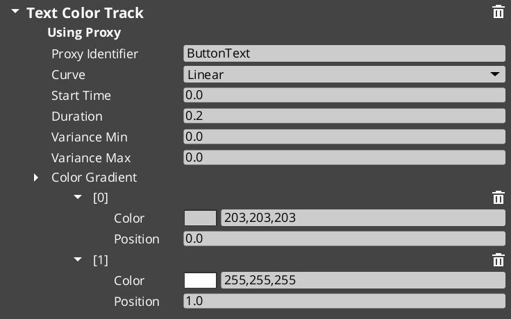
UI Animation is a domain extension of the GS_Motion system, purpose-built for animating LyShine UI elements. It provides eight concrete track types that target LyShine component properties (position, scale, rotation, alpha, color, text), a data asset format (.uiam) for authoring animations, and a standalone component for playing them on any entity.
The architecture follows the GS_Motion domain extension pattern: UiMotionTrack extends GS_MotionTrack as the domain base, each concrete track type targets a specific LyShine property, and UiAnimationMotionAsset extends GS_MotionAsset to bundle tracks into a single asset file.
For usage guides and setup examples, see The Basics: GS_UI.
Contents
Domain Extension Pattern
To add a custom track type, use the UiMotionTrack ClassWizard template — see GS_UI Templates. The template generates the header and source, and the only manual step is adding a Reflect(context) call in UIDataAssetsSystemComponent.cpp. Once reflected, the new track type appears automatically in the asset editor type picker via EnumerateDerived.
GS_Motion is designed to be extended per domain. GS_UI provides the UI domain extension:
| GS_Motion Base | GS_UI Extension |
|---|
GS_MotionTrack | UiMotionTrack – Domain base for all UI tracks |
GS_MotionAsset | UiAnimationMotionAsset – Asset container for UI tracks |
GS_MotionComposite | Used internally by UiAnimationMotion for multi-track playback |
GS_MotionProxy | Used internally by UiAnimationMotion for asset instance binding |
See GS_Motion for the full base system reference.
Track Types
UiMotionTrack
The domain base class that all UI-specific tracks extend. Inherits from GS_Core::GS_MotionTrack and provides LyShine entity targeting common to all UI tracks.
Concrete Tracks
Each track type animates a specific LyShine component property. All tracks are authored inside a .uiam asset.
| Track Type | Target Component | Property Animated | Value Type |
|---|
UiPositionTrack | UiTransform2dComponent | Position offset | AZ::Vector2 |
UiScaleTrack | UiTransform2dComponent | Scale | AZ::Vector2 |
UiRotationTrack | UiTransform2dComponent | Rotation | float |
UiElementAlphaTrack | UiElementComponent | Element-level alpha | float |
UiImageAlphaTrack | UiImageComponent | Image alpha | float |
UiImageColorTrack | UiImageComponent | Color tint | AZ::Color |
UiTextColorTrack | UiTextComponent | Text color | AZ::Color |
UiTextSizeTrack | UiTextComponent | Font size | float |
UiAnimationMotionAsset
The data asset that holds a complete UI animation. Extends GS_Core::GS_MotionAsset → AZ::Data::AssetData. Requires GS_AssetReflectionIncludes.h when reflecting — see Serialization Helpers.
| Property | Type | Description |
|---|
| Extension | — | .uiam |
| Motion Name | AZStd::string | A human-readable name for this animation. |
| Loop | bool | Whether this animation loops continuously after completing. |
| Tracks | AZStd::vector<UiMotionTrack*> | The list of animation tracks that make up this motion. Each track targets a specific LyShine property on a specific entity. |
To understand how to author Feedback Motions, refer to UI Animation: Authoring UIAnimation Motions
UiAnimationMotion
A serializable wrapper struct that bridges a .uiam asset to runtime playback. This is not a component – it is a data struct used as a field type in other components (such as GS_UIPageComponent’s m_onShow, m_onHide, and GS_ButtonComponent’s hover/select fields).
| Field | Type | Description |
|---|
| Asset | AZ::Data::Asset<UiAnimationMotionAsset> | Reference to the .uiam asset to play. |
| Motion Proxies | AZStd::vector<GS_MotionProxy> | Instance-specific bindings that map track targets to actual entities at runtime. |
| Motion Composite | AZStd::unique_ptr<GS_MotionComposite> | The runtime composite that coordinates multi-track playback. Created automatically from the asset data. |
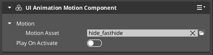
UiAnimationMotionComponent
A standalone component that plays a UiAnimationMotion on any entity. Use this when you need to trigger a UI animation outside of the page navigation or button systems – for example, an ambient animation on a background element, or a custom transition triggered from ScriptCanvas.
The component exposes the UiAnimationMotion struct in the Inspector, allowing you to assign a .uiam asset and configure it directly on any entity.
Adding Custom Tracks
Use the UIMotionTrack ClassWizard template to generate a new world-space track — see GS_UI Templates. The only manual step after generation is adding a Reflect(context) call in your {$Gem}DataAssetSystemComponent.cpp. Once reflected, the new track type is discovered automatically and appears in the asset editor type picker.
Override Init(ownerEntityId) to cache entity context, and Update(easedProgress) to drive the target property via its bus.
void ${Custom}Track::Init(AZ::EntityId ownerEntity)
{
    // Always call the base first — it sets m_owner.
    GS_UI::UiMotionTrack::Init(ownerEntity);

    // Cache the element's origin value so the track can apply additive offsets.
    // Example:
    //   UiTransformBus::EventResult(m_originPosition, ownerEntity, &UiTransformBus::Events::GetLocalPosition);
}

void ${Custom}Track::Update(float easedProgress)
{
    // Evaluate the gradient at the current eased progress and apply to the element.
    // easedProgress is in [0, 1] and already passed through the track's CurveType.
    // Example:
    //   const AZ::Vector2 offset = valueGradient.Evaluate(easedProgress);
    //   UiTransformBus::Event(m_owner, &UiTransformBus::Events::SetLocalPosition, m_originPosition + offset);
}
Usage Examples
Typical Animation Setup
A page fade-in animation might use two tracks in a single .uiam asset:
- A
UiElementAlphaTrack that fades from 0 to 1 over 0.3 seconds. - A
UiPositionTrack that slides the element 20 pixels upward over the same duration.
Assign this asset to a page’s On Show field and the page will automatically play the animation whenever it becomes visible.
A button scale-bounce on hover:
- A
UiScaleTrack that scales from 1.0 to 1.1 and back to 1.0 over 0.15 seconds.
Assign this to the button’s Hover Motion field. Assign the reverse (scale from current back to 1.0) to Unhover Motion.
See Also
For component references:
- Page Navigation – Pages use UiAnimationMotion for show/hide transitions
- Buttons – Buttons use UiAnimationMotion for hover/select animations
For conceptual overviews and usage guides:
For related resources:
- GS_Motion – The base motion system that UI Animation extends
Get GS_UI
GS_UI — Explore this gem on the product page and add it to your project.
4 - UI Interaction
Button animations and input interception — motion-driven hover/select states and input channel management for focused UI canvases.
UI Interaction covers the two systems that handle player input at the UI layer: the enhanced button component that plays motion-based animations on hover and select, and the input interceptor that captures and routes input events while a canvas is focused.
For usage guides and setup examples, see The Basics: GS_UI.
Contents
An enhanced button component that extends LyShine interactable behavior with motion-driven hover and select state animations. Attach alongside a UiButtonComponent and assign .uiam assets for hover, unhover, and select states.
| Component | Purpose |
|---|
| GS_ButtonComponent | Enhanced button. Plays UiAnimationMotion assets on hover, unhover, and select events. |
Button API
An input interceptor component that captures and redirects input events for UI-specific handling, preventing input from propagating to gameplay systems while a UI canvas is focused.
| Component / Type | Purpose |
|---|
| GS_UIInputInterceptorComponent | Intercepts configured input events and re-broadcasts them on UIInputNotificationBus. |
| GS_UIInputProfile | Data asset defining which input channels to intercept and how to route them. |
UI Input API
See Also
For component references:
- Page Navigation – Pages use the same UiAnimationMotion system for show/hide transitions
- UI Animation – The motion asset system used by buttons and pages
- UI Manager – Controls which canvas is focused, activating the input interceptor
For conceptual overviews and usage guides:
Get GS_UI
GS_UI — Explore this gem on the product page and add it to your project.
4.1 - Buttons
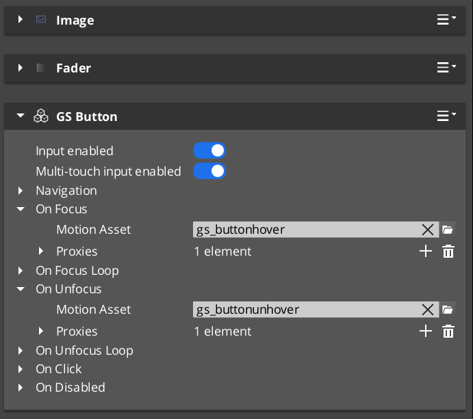
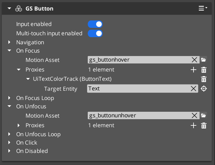
Enhanced button component with motion-driven hover and select animations, built on top of LyShine interactable notifications.
GS_ButtonComponent is an enhanced button that extends O3DE’s LyShine interactable system with UiAnimationMotion support. Instead of relying on LyShine’s built-in state sprites or color transitions, GS_ButtonComponent plays data-driven motion assets for hover, unhover, and select states, giving you full control over animated button feedback using the same animation system that drives page transitions.
The component attaches to any entity that already has a LyShine interactable (e.g. UiButtonComponent). It listens for LyShine interactable notifications and triggers the appropriate motion asset when the interactable state changes.
For usage guides and setup examples, see The Basics: GS_UI.
Contents
How It Works
LyShine Integration
GS_ButtonComponent connects to O3DE’s UiInteractableNotificationBus on the same entity. When LyShine fires hover, unhover, or press events, the component intercepts them and plays the corresponding UiAnimationMotion asset. This means you author your button animations as .uiam assets in the same workflow as page transitions and other UI animations.
The component does not replace LyShine’s interactable – it works alongside it. The LyShine UiButtonComponent still handles click detection, navigation, and accessibility. GS_ButtonComponent adds the visual animation layer on top.
Motion States
Each button can have up to three motion assets assigned:
- Hover Motion – Played when the interactable receives hover focus (mouse enter or gamepad navigation highlight).
- Unhover Motion – Played when the interactable loses hover focus.
- Select Motion – Played when the interactable is pressed/selected.
Each of these is a UiAnimationMotion struct that references a .uiam asset. The motion can animate any combination of the eight UI track types (position, scale, rotation, alpha, color, text size) to create rich button feedback.
Inspector Properties
| Property | Type | Description |
|---|
| Hover Motion | UiAnimationMotion | The animation played when this button receives hover focus. |
| Unhover Motion | UiAnimationMotion | The animation played when this button loses hover focus. |
| Select Motion | UiAnimationMotion | The animation played when this button is pressed. |
Usage
Setup
- Add a LyShine
UiButtonComponent (or other interactable) to your entity. - Add
GS_ButtonComponent to the same entity. - Author
.uiam assets for the hover, unhover, and select states using the UiAnimationMotion system. - Assign the
.uiam assets to the corresponding fields in the Inspector.
The button will now play the assigned animations automatically when the user interacts with it. No ScriptCanvas or C++ code is required for the animation behavior.
See Also
For component references:
- UI Animation – The motion asset system that drives button animations
- Page Navigation – Pages use the same UiAnimationMotion system for show/hide transitions
- UI Input – Input interception used alongside buttons in interactive canvases
For conceptual overviews and usage guides:
Get GS_UI
GS_UI — Explore this gem on the product page and add it to your project.
4.2 - UI Input
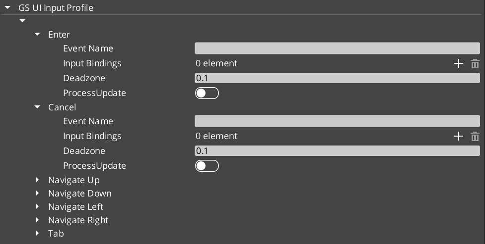
Input interception for UI canvases – captures and redirects input events to prevent gameplay propagation while a UI is focused.
GS_UIInputInterceptorComponent intercepts input events when a UI canvas is active, preventing them from propagating to gameplay systems. This solves the common problem of button presses or navigation inputs leaking through to the game world while a menu is open.
The component uses a GS_UIInputProfile to define which input events to intercept and how to route them. When the associated UI canvas is focused, the interceptor captures configured input events and broadcasts them on the UIInputNotificationBus instead of allowing them to reach gameplay input handlers.
For usage guides and setup examples, see The Basics: GS_UI.
Contents
How It Works
When a UI canvas receives focus through the UI Manager, the input interceptor activates. It listens for input events that match its configured GS_UIInputProfile and consumes them before they reach the gameplay input system. The intercepted events are then re-broadcast on the UIInputNotificationBus so that UI-specific logic can respond to them.
When the canvas loses focus, the interceptor deactivates and input flows normally to gameplay systems.
The input profile defines which input channels to intercept and how to map them for UI use. This allows different UI canvases to intercept different sets of inputs – a pause menu might intercept all gameplay inputs, while a HUD overlay might only intercept specific menu navigation inputs.
API Reference
Notification Bus: UIInputNotificationBus
Events broadcast when the interceptor captures input. Multiple handler bus – any number of components can subscribe to receive intercepted input notifications.
Components that need to respond to UI-specific input (such as custom navigation logic or input-driven UI animations) connect to this bus to receive intercepted events while a canvas is focused.
Inspector Properties
| Property | Type | Description |
|---|
| Input Profile | GS_UIInputProfile | Defines which input events to intercept and how to route them for UI handling. |
Usage
Setup
- Add
GS_UIInputInterceptorComponent to the same entity as your root GS_UIPageComponent. - Configure the
GS_UIInputProfile to specify which input channels should be intercepted when this canvas is focused. - Any component that needs to respond to intercepted input connects to
UIInputNotificationBus.
See Also
For component references:
- UI Manager – Controls which canvas is focused and therefore which interceptor is active
- Page Navigation – The page system that drives canvas focus changes
- Button – Button animations used alongside input interception
For conceptual overviews and usage guides:
Get GS_UI
GS_UI — Explore this gem on the product page and add it to your project.
5 - Widgets
Standalone UI widget components — load screens, pause menus, and other self-contained UI elements that operate outside the page navigation model.
Widgets are standalone UI components that handle specific UI scenarios outside the page navigation hierarchy. Unlike pages, which are navigated to and from, widgets activate and deactivate in response to game events — a load screen appears during a stage transition, a pause menu overlays gameplay when the player pauses.
For usage guides and setup examples, see The Basics: GS_UI.
Contents
Load Screen
GS_LoadScreenComponent manages loading screen display during stage transitions. It listens for stage load lifecycle events and shows or hides a designated LyShine canvas accordingly.
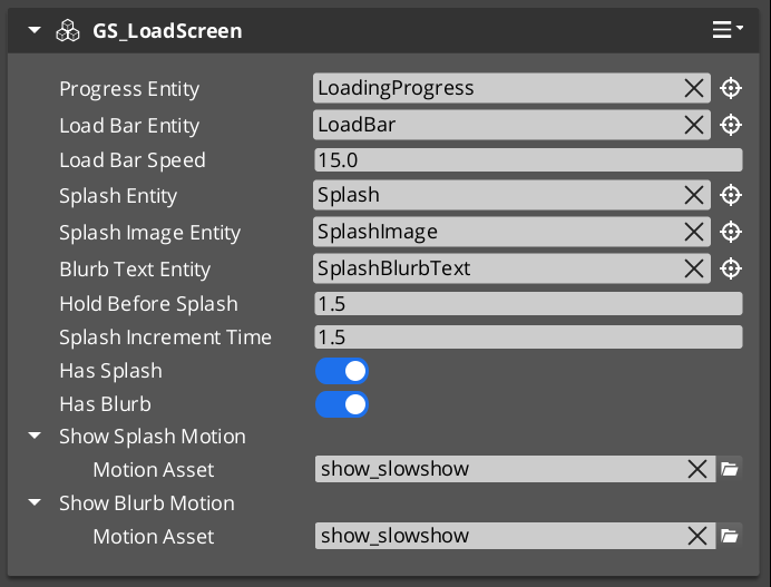
| Component | Purpose |
|---|
| GS_LoadScreenComponent | Displays a loading canvas during stage transitions. Hides automatically when loading is complete. |
PauseMenuComponent manages the pause overlay. It responds to pause input, activates the pause canvas, and suppresses gameplay systems while the menu is open.
| Component | Purpose |
|---|
| PauseMenuComponent | Toggles pause state and the pause menu canvas overlay. |
See Also
For component references:
- UI Manager – Loads and manages the canvases that widgets display on
- Page Navigation – The navigation system for menus within widget canvases
For conceptual overviews and usage guides:
Get GS_UI
GS_UI — Explore this gem on the product page and add it to your project.
6 - Templates
ClassWizard templates for GS_UI — custom UI animation motion tracks.
All GS_UI extension types are generated through the ClassWizard CLI. The wizard handles UUID generation and cmake file-list registration automatically.
For usage guides and setup examples, see The Basics: GS_UI.
python ClassWizard.py \
    --template <TemplateName> \
    --gem <GemPath> \
    --name <SymbolName> \
    [--input-var key=value ...]
Contents
Ui Motion Track
Template: UiMotionTrack
Creates a custom animation track for the GS_UI motion system. A UiMotionTrack child animates one LyShine UI element property (position, scale, alpha, color, rotation, etc.) over a normalised [0,1] eased progress value. Tracks are added to UiMotionAnimations assets in the editor and played by UIMotionAnimationComponent.
Generated files:
Include/${GemName}/UIMotions/MotionTracks/${Name}Track.hSource/UIMotions/MotionTracks/${Name}Track.cpp
CLI:
python ClassWizard.py --template UiMotionTrack --gem <GemPath> --name <Name>
Post-generation — manual registration required:
In UIDataAssetsSystemComponent.cpp, add:
#include <path/to/${Name}Track.h>
// inside Reflect(context):
${Name}Track::Reflect(context);
Extensibility: One track class per animatable property. Any number of track types can be registered. Instances are stored as polymorphic pointers in UiMotionAnimation assets — the property editor’s type picker discovers them automatically via O3DE’s serialization reflection (EnumerateDerived).
See also: UI Animation — the full track architecture, domain extension pattern, and built-in track type reference.
See Also
For the full API, component properties, and C++ extension guide:
For all ClassWizard templates across GS_Play gems:
Get GS_UI
GS_UI — Explore this gem on the product page and add it to your project.
7 - 3rd Party Implementations
For usage guides and setup examples, see The Basics: GS_UI.
Get GS_UI
GS_UI — Explore this gem on the product page and add it to your project.